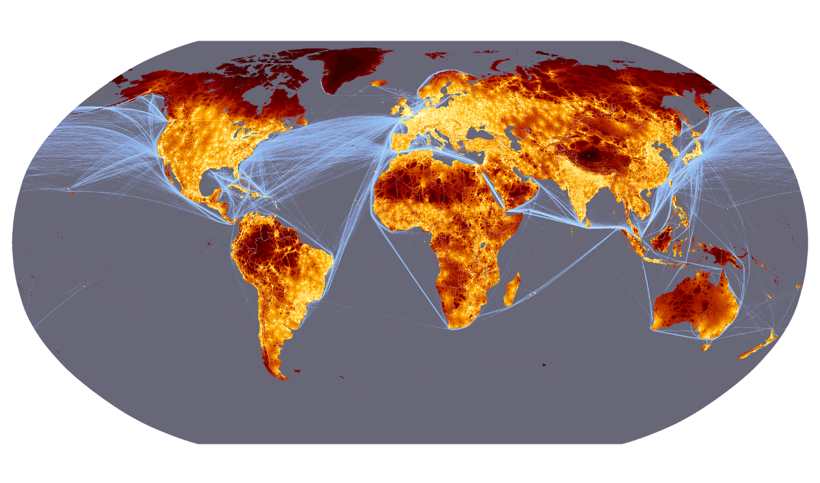
The digital version of my map looks better because the color variations are more noticeable. The printed version ends up with one really bright blue, which I don't care for. Also, my neat little corner brackets got cut when I printed. The color back ground looks pretty even, but the printer didn't quite get it right.




.jpeg)
